Every brand has its own DNA, it’s own core values. The clearer this story and culture is, the better the match between future employee and the company.
Glyph specialises in customising photography concepts and styles to fit each brand to resonate their core values. These are some examples.
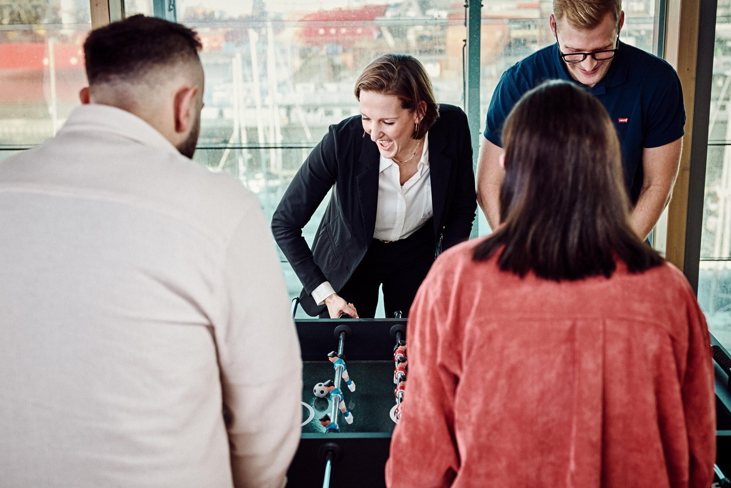
With three service pillars working as one, regrouping every creative marketing discipline, ACE helps brands grow young: to stay connected, culturally relevant and ahead of tomorrow. ACE is creative, ahead of the market, and also well aware of past icons.
The photography ask was to show buzz, creativity, a world energy and flow are the norm. By using poppy flash, and poppy colours in combination with a pristine white backgrounds, a fresh style was made. By using props and expressions, the personalities of the individuals really came to life.
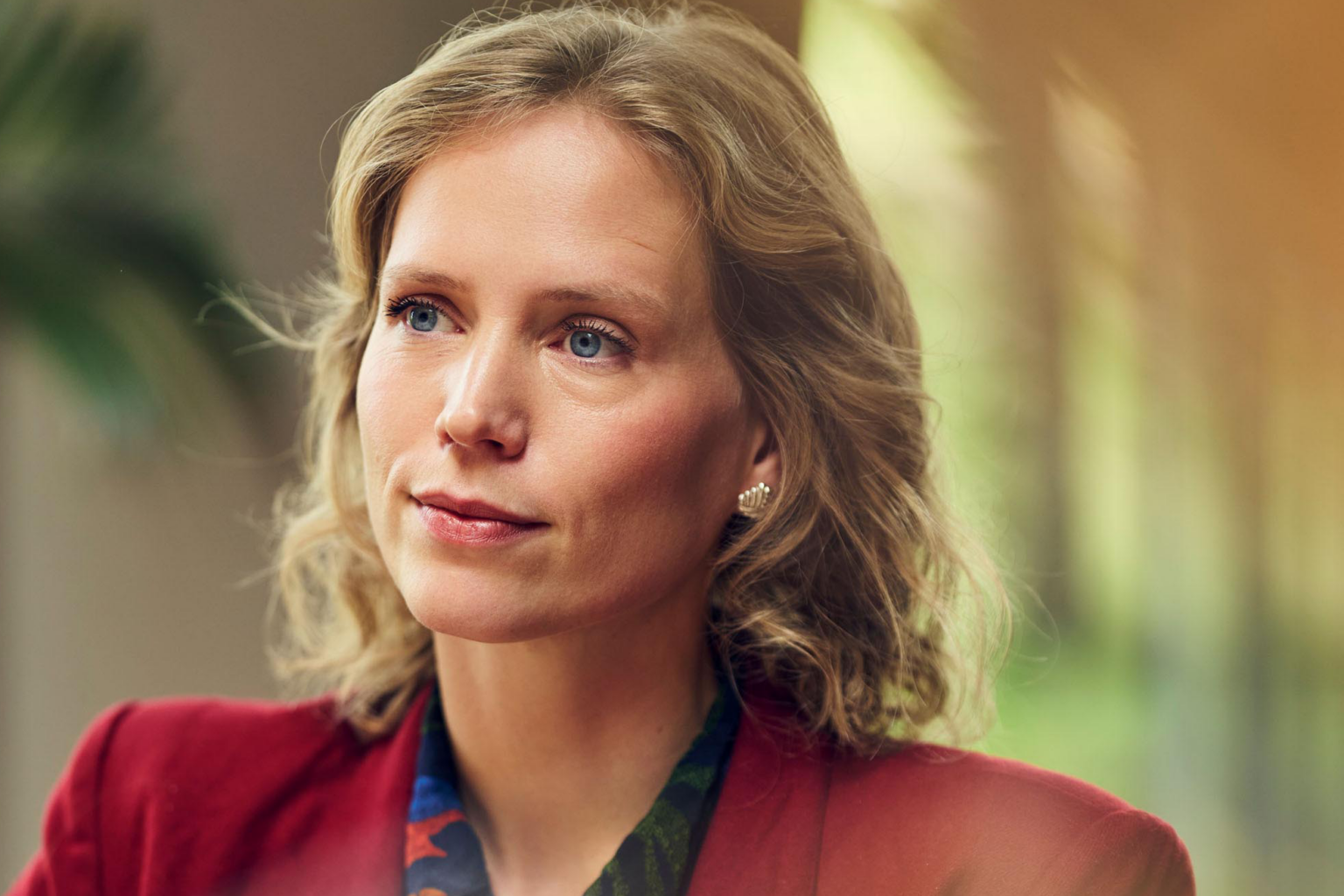
KPMG
A company that has a deep and wide authority on audit, advisory and tax, the visual tone of voice needed to show professionalism and control. But also humanness, with a hint of class. Working with scouted employees from KPMG, we directed situations as they would happen in daily life.
By using glass and carefully placed objects, softness of the images give the stage to the focus of the models. Soft colours, and carefully placed directional light gave the colour grading with a slight golden feel a distinct character. See more.
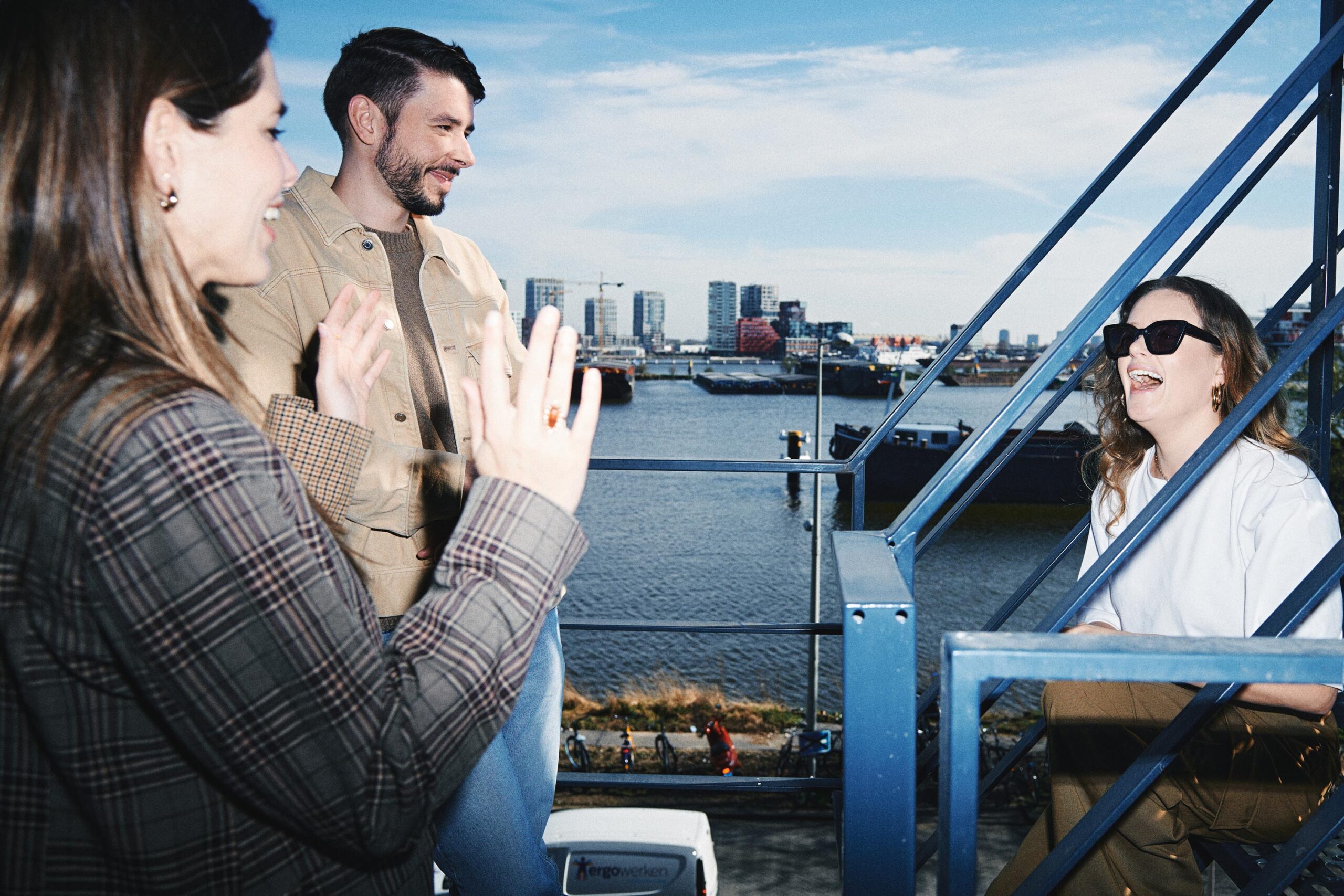
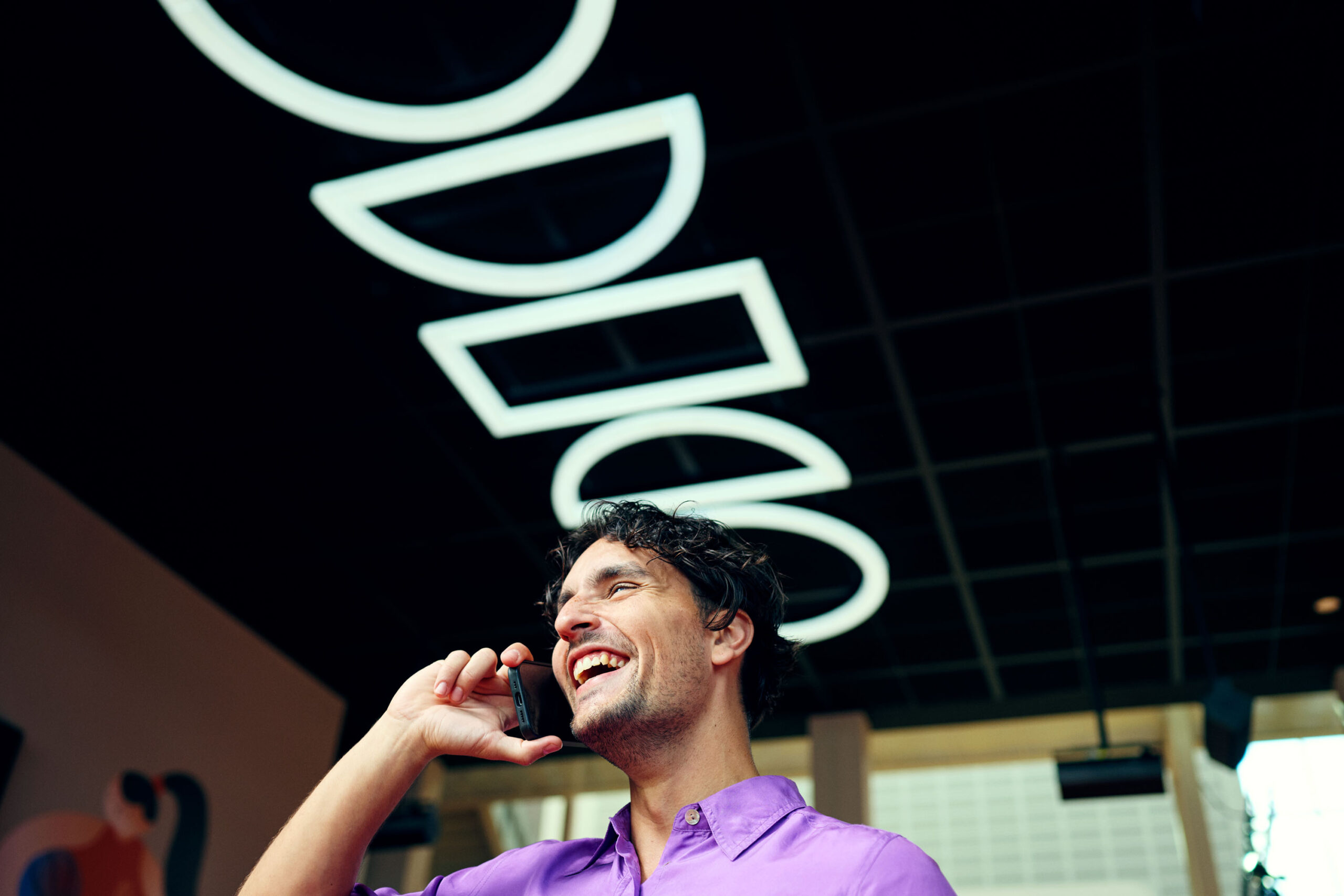
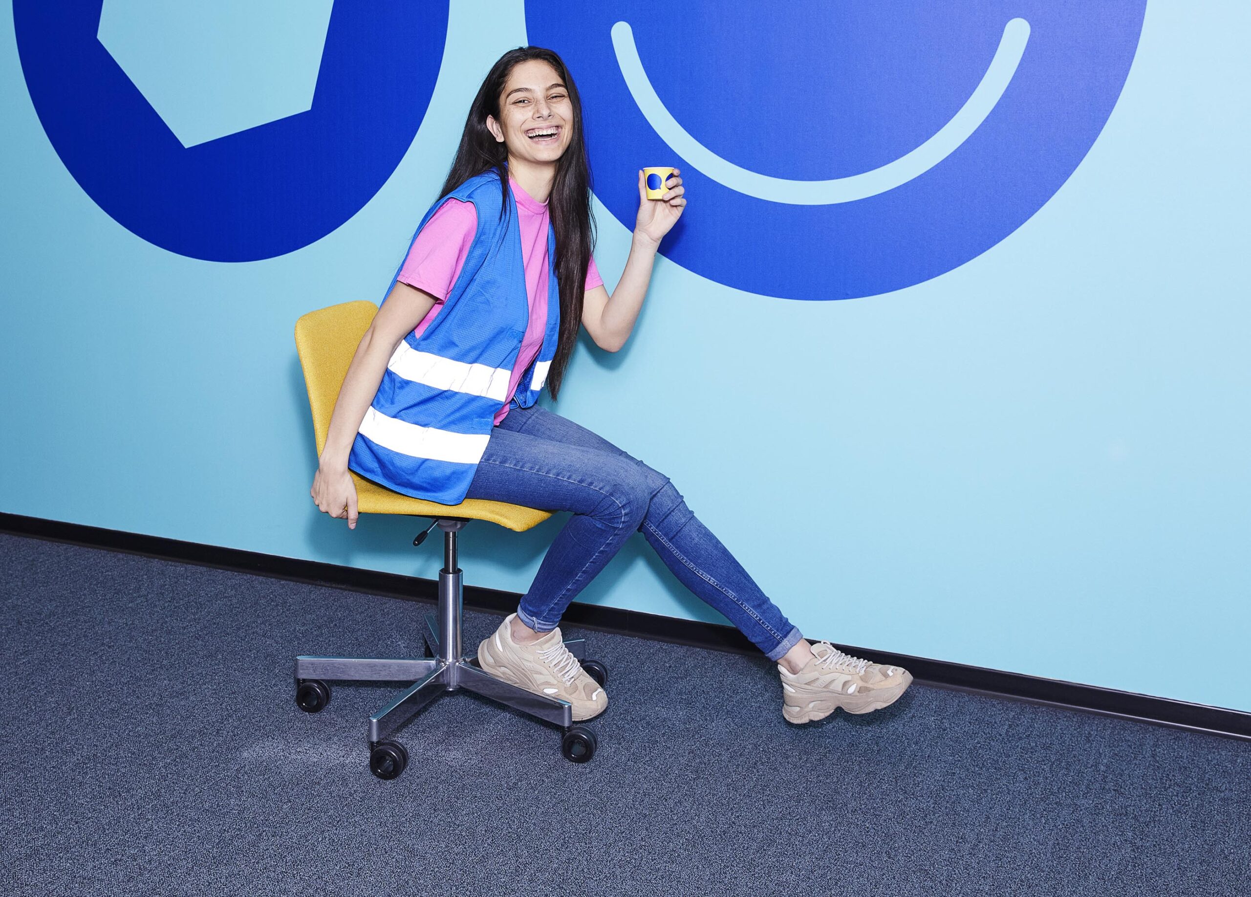
Odido
Odido improves telecom by making it more human. And we see the person behind the role. Odido stimulates talent, which also comes from diversity.
An open culture on the cutting edge of innovation.
Fresh, ambitious, colourful and with hints to the b2c branding, locations where chosen within the building, as where the talents. By using Odido-brand colours, bright light and glanses outside of the image, an taste of the collective culture is given.
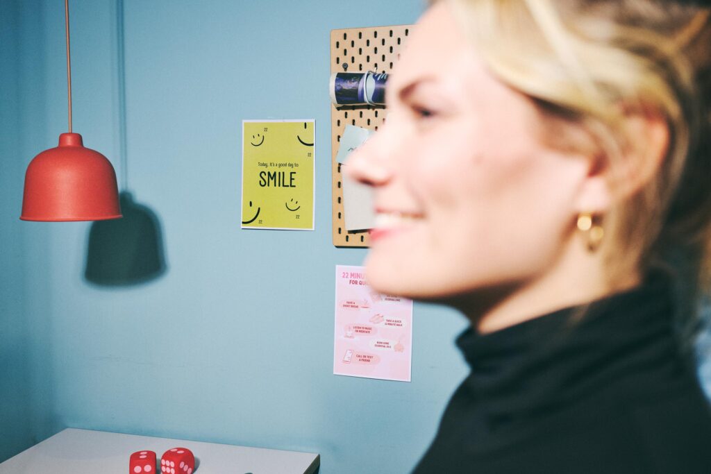
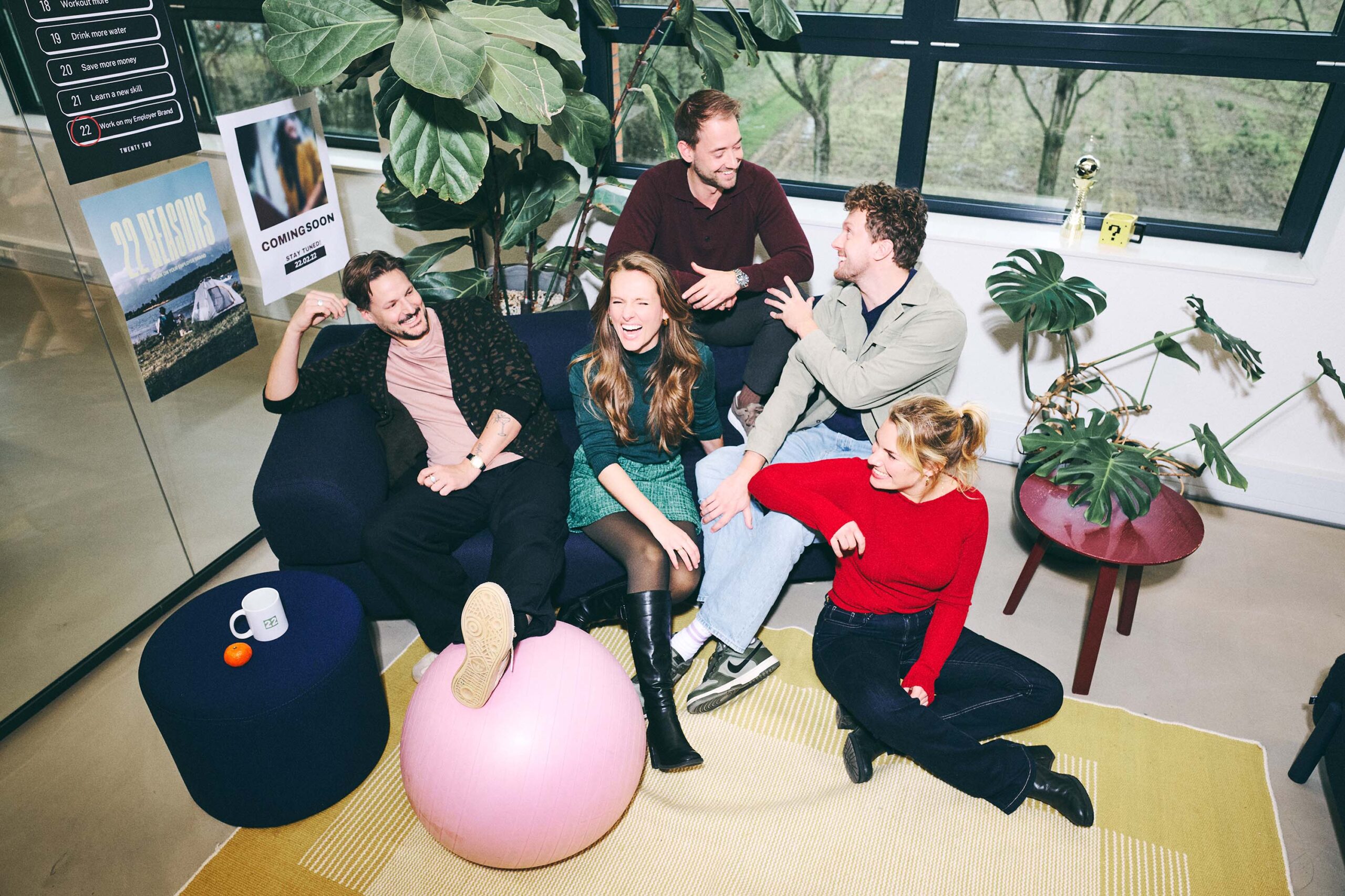
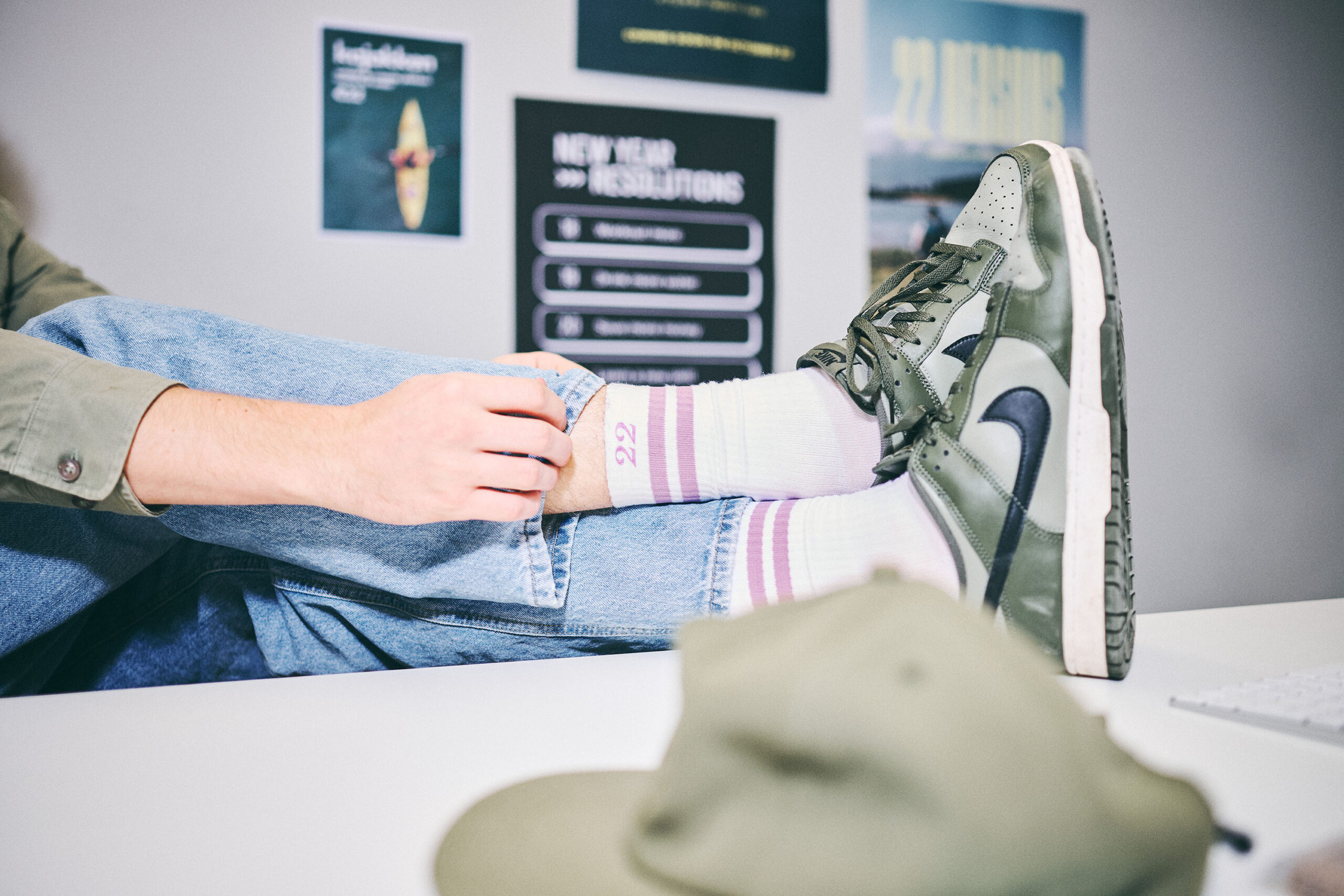
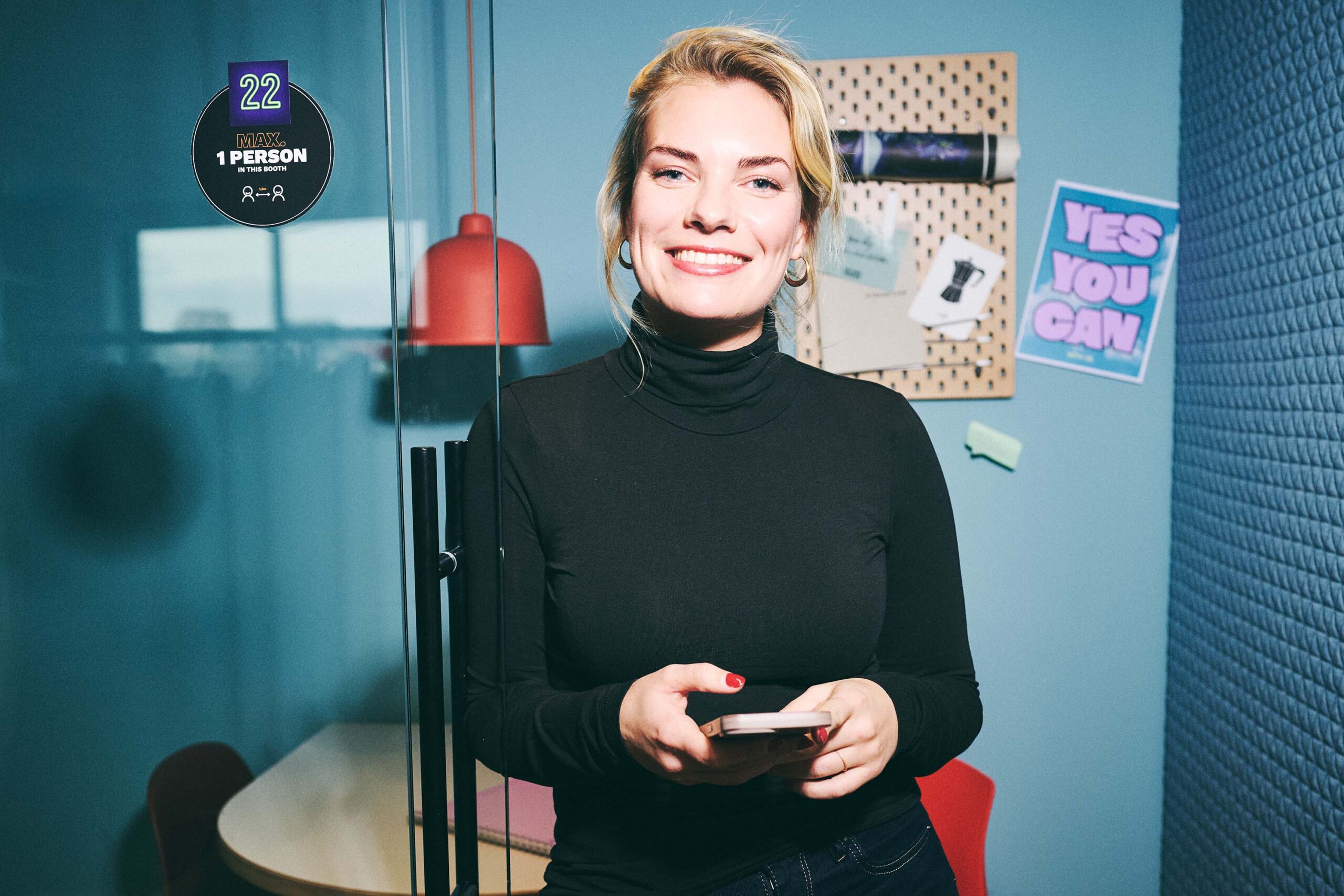
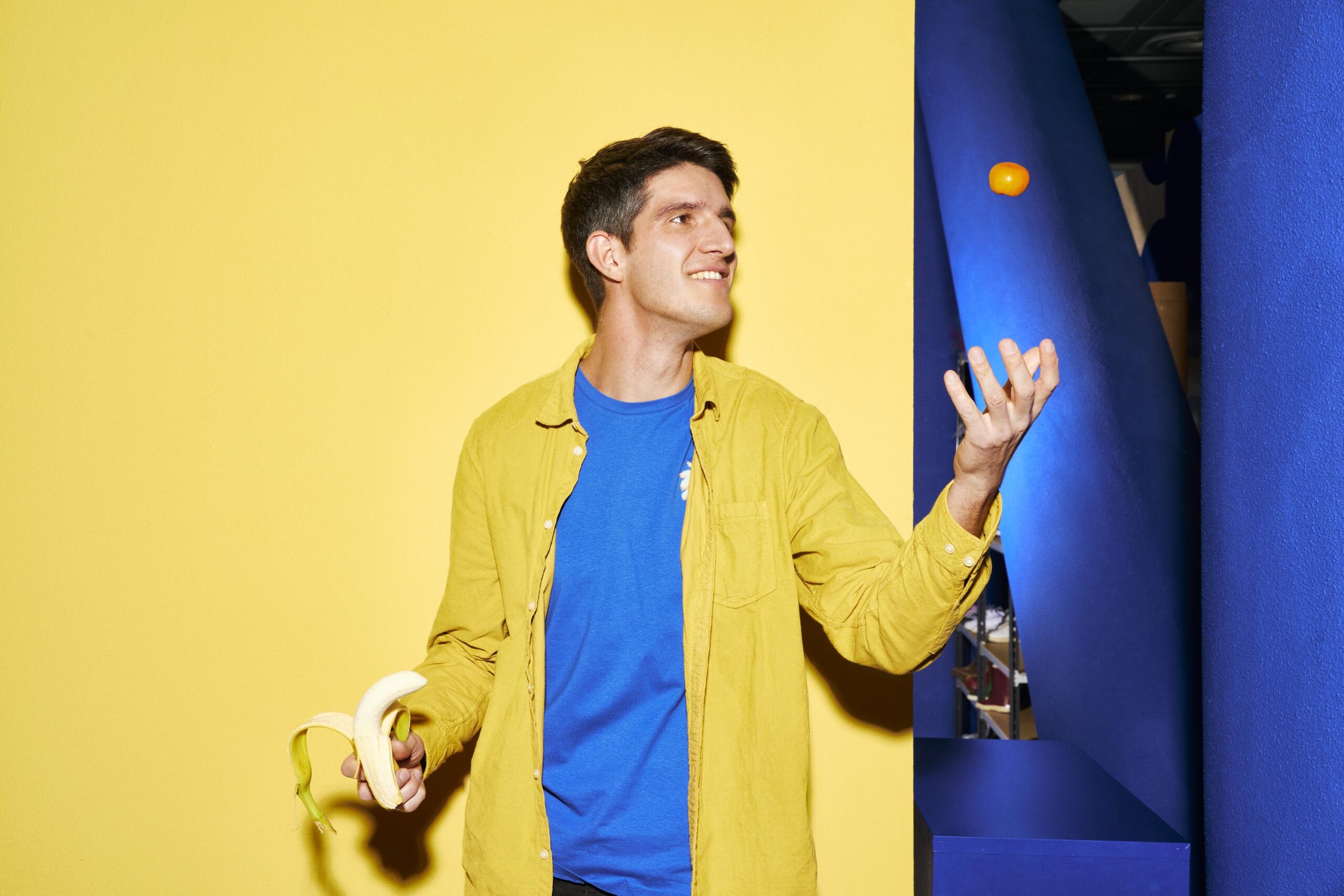
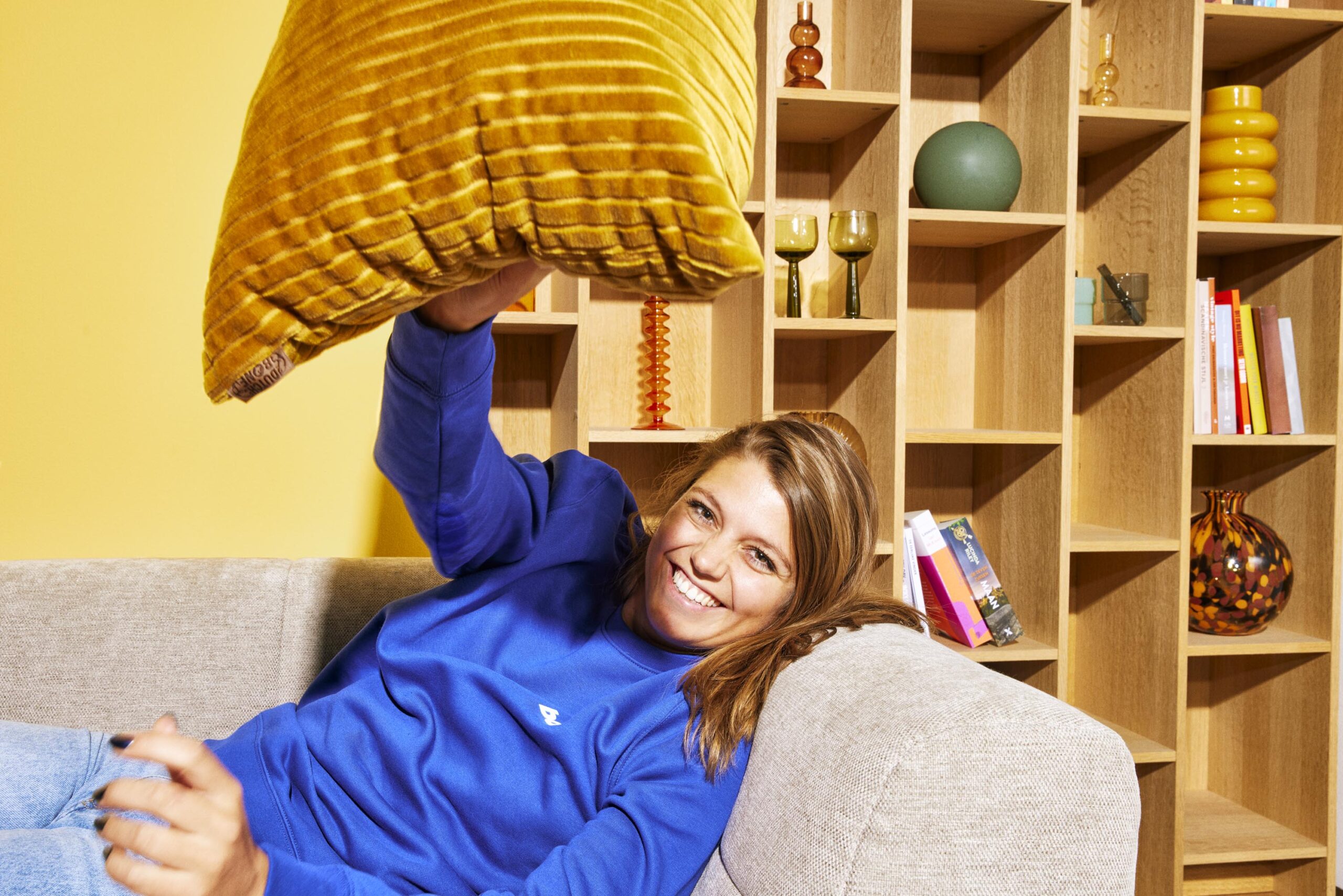
Twenty Two Work
Marketing agency for employers
Lead by example – Twenty Two does the marketing for the job market: for brands like Odido and PostNL. So their visuals must breathe everything Twenty Two is: Young, quirky, creative and incredibly to the point.
By using a poppy, crisp light and directing with fun and humour, the vibe is easy to look at, colourful fun and super approachable. We circled the visual concepts around the winning number, check it here.
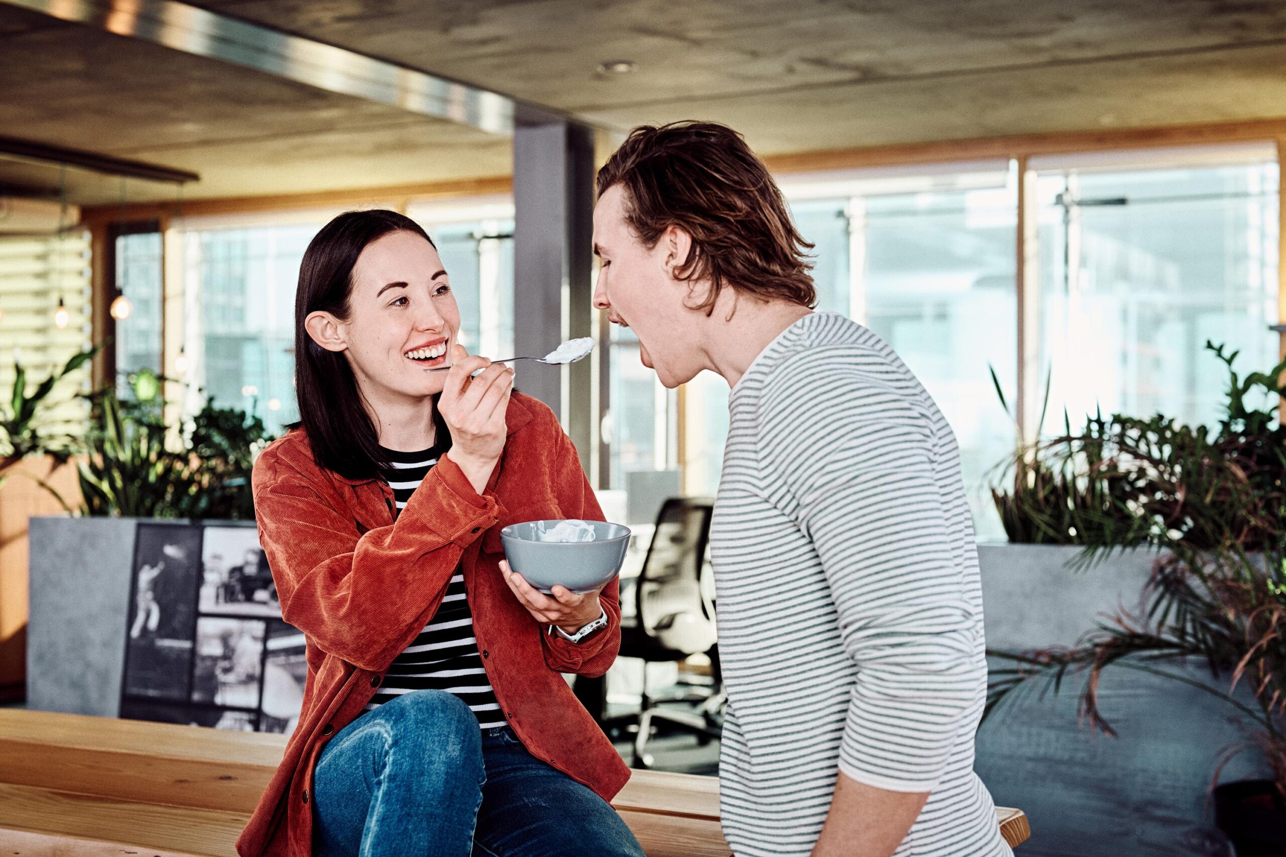
bol Employer branding
Bol communicates it’s brand to professionals as fun, yet highly challenging, premier league career lines.
Moments, frozen in in an instant of collaborative fun and using the colour blocking language from the B2C identity of bol, the colour placement, logo use and distinct use of flash gives its own distinct style.
Joinson & Spice
Joinson & Spice is the leading accounting boutique for tech scale-ups. They are a data-driven accounting agency for tech scale-ups. They leverage technology knowledge to help clients scale.
Combining the old with the new accountancy and tech – fresh, quirky, but also classic and true to thorough professionalism. The black and white portraits and the fun moments are brought together with the green elements.
Medline
Medline is a global medical devices company with a focus on patient-centred care and healthcare efficiency. Ranging from small hygienically packaged rubber gloves to complex systems for facilitating operations.
For the look an approach we created a classic, thorough, professional atmosphere – values that resonate with the brand, besides the distinct blue that Medline breathes. See more on our Medline work.
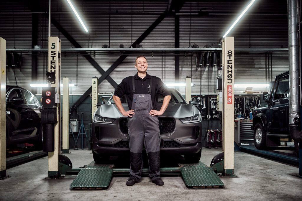
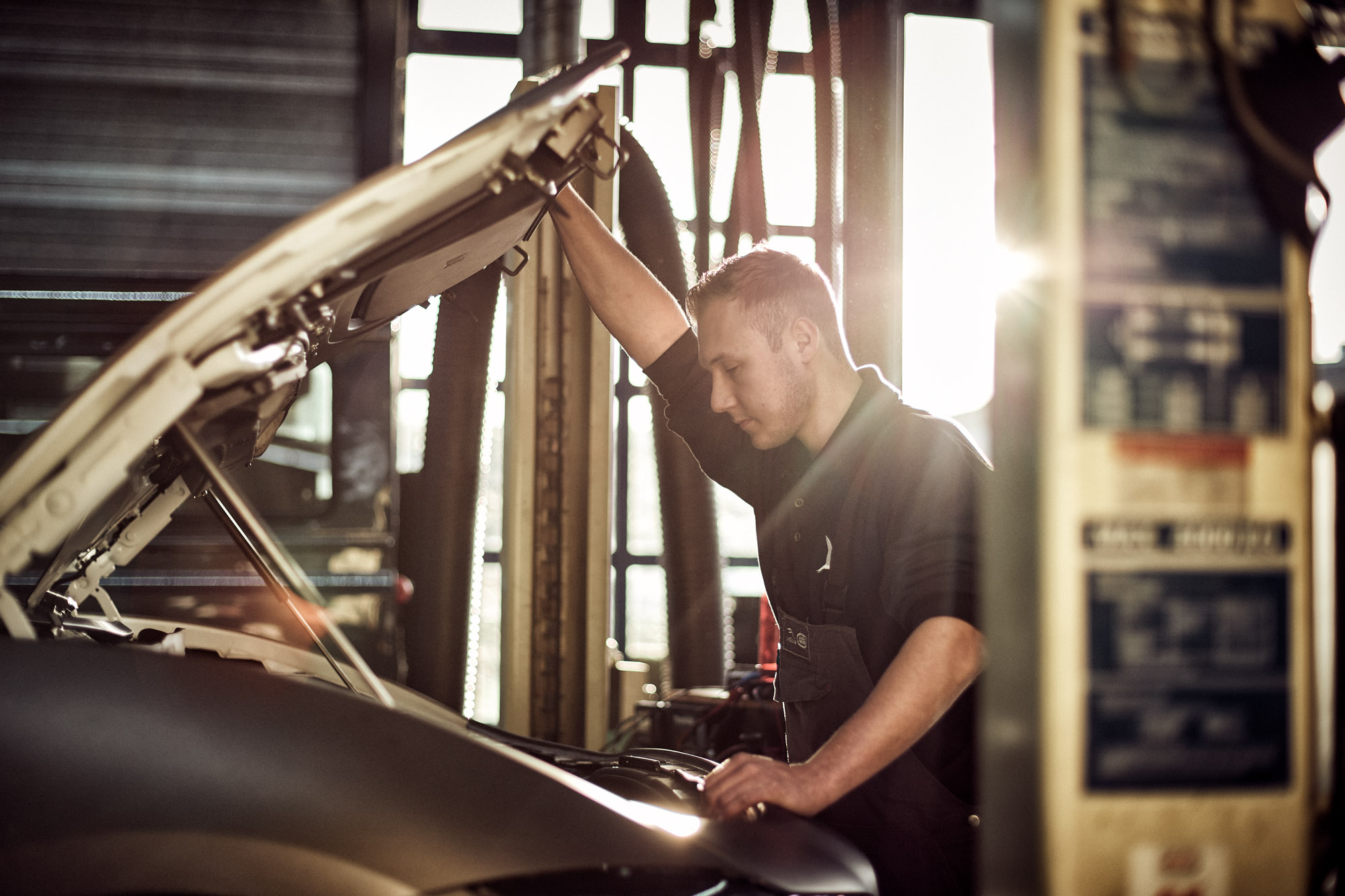
Hedin Automotive
Hedin Automotive, previously Stern: They are the ‘Autohart van Nederland’. Not only on the customer-side, but also strongly for those who just love cars, and want to make it their career. A car you love is also a voice of personality – to drive it, to work it to its original state, to love the mechanics.
Showing the different roles within the company as people with their cars in a symmetric approach was a large part of the campaign. Visuals of showing the love at work formed the second part of the project. The contrasty colours we chose to use made the feeling of material connection even stronger.


